Urja Drishti
An interactive data platform built for McKinsey & Company to accompany a landmark report on India’s power distribution companies — commissioned by the Ministry of Power.
McKinsey & Company engaged us to build the Urja Drishti portal — a companion to a major report they produced on the functioning of DISCOMs, India’s electricity distribution companies, commissioned by the Ministry of Power. The report introduced a custom methodology for rating DISCOMs across hundreds of parameters, producing a comprehensive national ranking. Our mandate was to bring that methodology to life as an interactive platform — one that would let policymakers, researchers, and the public explore the scores, understand how the rankings were derived, and drill down into the performance of individual distribution companies and states. The portal served its purpose as a companion to the published report and has since been decommissioned.
A data platform for understanding India’s power distribution sector
-
DISCOM Ratings & Rankings Portal
The core of the platform was a portal that published McKinsey’s rating methodology transparently — displaying the hundreds of parameters under which each DISCOM was evaluated, the scores awarded across those parameters, and how the calculations rolled up into a national ranking. The goal was to make a complex, multi-layered methodology legible to a wide audience without losing its rigour.
-
Analytical Dashboard with Parameter Drill-Down
Beyond the high-level rankings, we built a comprehensive analytical dashboard that allowed users to drill into each parameter in depth — seeing how individual DISCOMs performed across specific evaluation criteria, comparing performance across companies, and understanding where scores were won or lost. This layer was designed for users who needed more than a headline ranking.
-
Geospatial Performance Maps
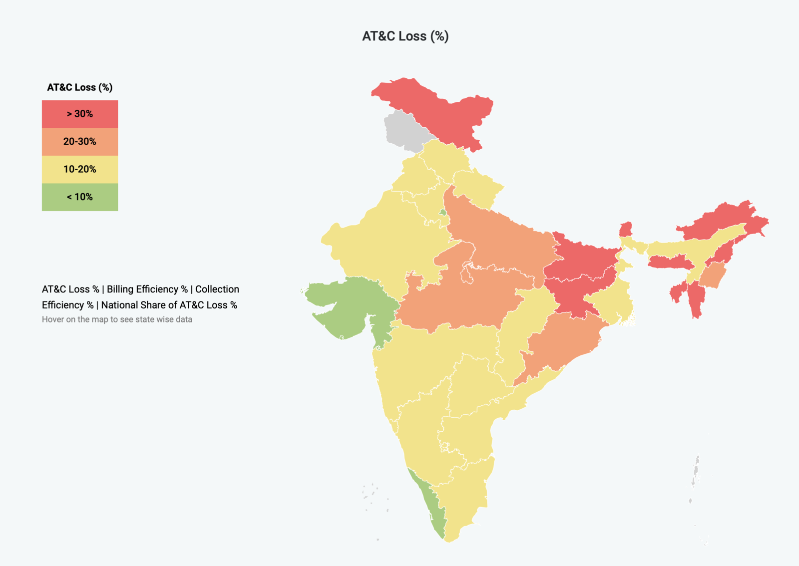
We built interactive map views rendered on a custom vector map of India, showing power distribution performance at the state and Union Territory level — aggregated from the scores of DISCOMs operating within each region. The maps provided an immediate spatial reading of where distribution performance was strongest and where improvement was most needed, adding a geographic dimension that summary tables alone could not convey.
-
Custom Data Visualisations
The platform featured a range of custom visualisations built with D3.js, designed specifically around McKinsey’s evaluation framework. These were not off-the-shelf chart components — each visualisation was tailored to represent the structure of the data clearly, from multi-parameter radar charts to comparative bar views and score breakdowns, ensuring the complexity of the underlying analysis was accessible rather than overwhelming.
-
Django Backend & Next.js Frontend
The platform was built on a Django backend handling the data layer, scoring calculations, and API endpoints, paired with a Next.js frontend that delivered a fast, structured user experience. This separation allowed the data model and the presentation layer to evolve independently — important on a project where the underlying scoring methodology was being refined in parallel with development.
-
Scoring Engine & Data Import Pipeline
This is the deliverable we are most proud of. McKinsey’s scoring methodology — spanning hundreds of parameters across every DISCOM in India — existed as a complex set of Excel workbooks. Our engineers did not simply receive a data file and display it. They studied the methodology in depth, understood the weighting and aggregation logic behind each parameter, and then implemented the entire scoring engine in Django. From that point on, the process that had required manual Excel work was fully automated: raw input scores could be imported through an admin interface, and the platform would immediately recalculate every derived rating and the final rankings — with no manual intervention. This speaks to something we value deeply about our team: they bring analytical thinking to engineering problems, not just technical execution.
Working with complex data?
If you need to make a large, multi-dimensional dataset legible — through dashboards, maps, or custom visualisations — we’ve done it at policy scale.
Start a conversation